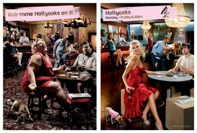
The Hollyoaks advert is quite vague in what it represents, its mocking other soaps such as Eastenders, Emmerdale, Correnation St, and that Hollyoaks isn't about drunken people at pubs, but much more young, glamorous and sophisticated.
The poster has a theme of spot the difference running through it, as the theme of a social setting run through out both. However one is set in an old, dirty pub, and the other is in a bright, glamorous bar.
The cast is also different as in one they are old, overweight and middle class, and the Hollyoaks one everyone is fit, beautiful, young and rich.
The slogan "rub some Hollyoaks in it" reinforces the idea that Hollyaoks is more for the younger audience and that Hollyoaks isn't the same as all the other soaps. Furthermore, as seen rubbing Hollyoaks on the photograph elevated the image giving it a sense of celebrity-feel. This could suggest that by watching the soap the pun is echoed and their life is uplifted. In addition, the lower class audience could watch this in attempt to escape their boring life style.
The channel in which the soap plays on is revealed on the lefthand side because that it the side of which the "true" hollyoaks is portrayed. The channels' symbol creates brand identity as it is well known, this benefits the poster, as people who are not familiar with the soap trust the channel so there for want to watch the soap, as a result the symbol could possibly attract potential viewers.
It could be argued that this poster is making a mock of other soaps as on the dirty half it is set in a "pub", which soaps such as Eastenders and Emmerdale have, and plays a huge role in their soaps. Therefore, it the Poster raises the soap, stating that it is better than any other soap, this is successful as it promotes the soap well.
Soaps are predominately watched by women so the main attractions of this poster are female. The right side appears to be more feminine; clean, glam and elegant. The dog chosen on the right hand side also connotes an rich, female celebrity whereas the other dog is more masculine and unattractive. More over they used pink to enhance feminine tone to the poster.
Finally, this poster both follows and challenges conventions of a successful poster, firstly because the target audience are not focused on the poster for a few seconds, because of the 'spot the difference' theme so they audience have to concentrate harder on the poster. This is risky because at first glance the audience might be confused a not be drawn into the poster, therefore not promoting the poster to its highest potential. However, it is primarily image, so it does follow that convention
No comments:
Post a Comment