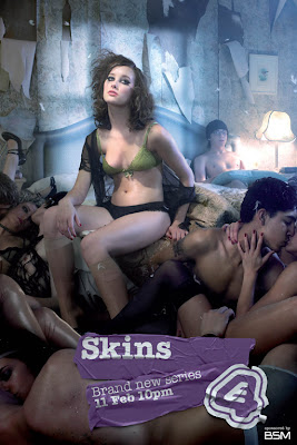
The Skins poster, at first glanced seems very disturbed, as it consists of naked, drunk teenagers kissing each other. However if u look close you see that the main character Michelle is sitting alone at the top, which could show that either she has more authority than the others or that in the next seasons show, she will not be in a relationship and therefore is portrayed as isolated. We also see Sid sitting alone at the other end of the bed suggesting to the audience that the story line might be a lot about them.
We also see Anwar kissing a girl that's identity is not in view, creating suspense for the character as they don't know who she is. This is effective as it enhances the poster making the audience ask questions like" who is she?", and "why are they all undressed?".
The poster is also quite stereotypical view of teenagers today, as most of them are wasted. But also showing the audience that the show will still consists of a lot of partying, troubles, sex, and on/off relationships. These aspects are all things that the target audience could possibly relate to and further persuade them to watch the programme. Teenagers could also be divided into subcultures in which a majority could share similar qualities to the characters in the show.
Posters are often image dominated, intentionally to focus the audiences attention on the main feature. This poster definitely has followed this convention as it is noticeably mainly image. The photo speaks for it's self and intentionally portrays the soap in a vivid and dramatic way. We felt that this approach was successful because it does not take too much of their time yet still engages them enough to convince them to watch the soap.
Additionally, it is conventional and better yet, necessary for posters to state the title and issue date of the soap. Overall, this poster has successfully made sure that in just a few seconds their target audience is attracted by using techniques that appeal to the market. The layout was very important as it followed conventions and satisfied expectations as it had minimal text and a large image.
No comments:
Post a Comment