Wednesday, 2 December 2009
Storyboard Animatic
This is our animatic storyboard for our soap trailer. It essentially shows what will happen in each scene from drawn images using our main characters, locations and camera shots. The storyboard helped us as we followed most of it however we did have to switch some of the characters around and their names apart from that our main storyline was quite similar.
Wednesday, 4 November 2009
Ancillary Task: Poster
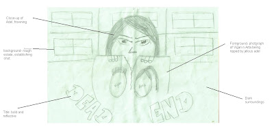
In our poster we have a close-up of Adel frowning holding a picture of Vigan and Arta she is seen as ripping the picture apart seen through the line in the middle as she is jealous of Arta being with Vigan. In the background we will have a rough establishing shot of an estate represting the wherarbouts of the scenery in which our film was filmed. We will make this estate in black and white to make it seem more grittier and a sort of in your face edgy element. The title of our movie is 'DEAD END' which will be done in graffiti style writing in red in order to represent the style of our movie.
Ancillary Task: TV Mag

This is our draft for our magazine. It will be dominated by a photo of Russell and kate in the foreground and a photo of Adel in the background showing the three main characters in our soap. Our headline will be named 'Love Triangle' as these three characters are in a difficult love situation. However below this we have a rhetorical question stating 'Who Will Russell choose?' this creates suspence to the audience as seen from the photograph their are two girls beside him. Additionally we will have other soap storylines below and these will have boxes around separating each soap. Moreover there is a caption saying '7 pages of soap' in a spikey outline this is eye-catching and attracts our target audience followed by a similar one stating our price costing at 'ONLY 40p', this will be done in red in order to engage our audience at our low costing price.
Sunday, 18 October 2009
Diamond Productions Logo

This is our production logo which we made in photo shop. we chose to do it in this way so we are able to relate the word 'Diamonds' with the background therefore we added a few crystal diamonds on the right hand corner and also a glow of sparkle in the 'i'. we also chose to make the background black in order for the writing to stand out.
The Title

We chose to name our soap Dead End as it represents what young people living in Urban London are heading towards, or what most believe, especially some of characters in our soap, for instance Kate’s character.
We were inspired for out title by the W10 LDN title, as it is reflective of youth and urban society. We downloaded the font form the internet. From many to choose from we decided RaftaGraph as the style of writing is recognised by young people.

We chose bold colours such as black, red and yellow as we thought they complemented our Dead End title quite well. In our trailer we wanted to present the audience with one of the biggest challenges; gun crime, gang violence and death, hence the red in out title. The black shadow effect gives it a dark feel, and the yellow contrasts with the red and black, making it seem more professional while also helping it stand out.
Thursday, 15 October 2009
The Script
By Arta Begu
Open to a close up of a foot getting out of a car. Atmosphere is grey and quite. We move to a mid-shot of Kate getting out of the car, then to a fast pan of the new neighbour hood.
In the next scene we see Kate and Russel bumping into each other in a 6th form common room. They shake hand and part.
In the next shot we see Kate at her locker. Adel here comes in for the first time. She slams the locker.
ADEL
IM ADEL!
We then move to see a group of young 6th formers on computers. One of the girls notices Kate and Adel.
AYSHA
Ah she gona go mad!
We here the school bell go off and move to a class room.
Mr HULL
Right thanks for those who handed in their coursework, hope everyone has a great weekend. You guys can go now.
Mid shot from behind the class room from the students point of view. They all get up and leave. We change shots from a mid shot of from the door to see Kate and Mr Hull behind her.
Mr HULL
Not you Kate Emmerton. Sit down!
We then change shots to see Kate from a high angle over the shoulder shot.
Mr HULL
Why didn’t you hand in your coursework?!
KATE
But sir...
Mr HULL
No!
KATE
But the thing is sir that...
Mr HULL
No! I want it on Monday!
We change setting into Kate’s home, where she is sitting doing her homework. Mal is on the bed with her son, she checks her phone and jumps up.
MAL
You hav ta look after him tonight!
KATE
Mal no!
MAL
Please iv got to go to work!
KATE
Mal am doing my coureswork!
MAL
Please babe!
(she hands the baby to Kate)
THANKS LOVE YOU!
We change shots to see Kate sitting on her bed. We get three different shots, where Kate changes her position. The baby is crying through out this scene. WE then see a close up of Kate’s phone saying Russell Calling.
We change setting again to see Kate in the school toilets. Adel slams one of the cubical doors open. We see 3 short, quick shots of Kate being beating by Adel. In the last shot, Adel slaps Kate, which we will see in slow motion.
We change setting to see a mid shot Kate sitting on a street wall, with her face all bruised. The atmosphere here is grey. We then get a close up of her face, the as she pulls her hood up we get a fast zoom out, where we change scene.
In the next scene we are back in the canteen where we see Adel, Russell and a few other 6th from friends. We see Adel trying to get Russell's attention but then he gets up and moves from the table.
We change scene, a long shot of a row of school lockers and Kate walking down, the Russell comes in and hugs her from behind. We change shots to a close mid shot of Kate and Russell looking at each other as they walk off.
We change setting to a mid mid shot of Russell leaning again a street wall, he is calling Kate. We change to a mid shot of Kate on her bed reading a book, answers her Phone.
KATE
Hi
RUSSELL
Hey, come out side okay?
We see a low angle shot of Kate looking down at Russell from her window. Long shot of Mirsad and Dardan coming toward Russell from across the street.
MIRSAD
AINT YOU MEANT TO BE WITH MY SISTER?!
We see Kate backing away from her window. Switch shots to and back from Kate running down her stairs and the fight scene. We hear a gunshot. 180 degree pan of Kate looking staring away, with a the police cars’ flash on her face.
BOB
(V.O)
Catch DEAD END on Thursdays at 9.
Black out, DEAD END title comes up.
END
Wednesday, 14 October 2009
Main Idea
Then we see Kate bumping into Russel in the 6th form common room, they introduce themselves to each other, we see sparks fly.
Adel notices this and turns to Aysha, they exchange looks, Adelina is about to mention Kate's name, when we change shots and Adel slams Kate's locker and introduces herself in and abrupt way.
We hear the school bell ring and Kate is running out of the class room. Mr Hull is yelling at her about overdue coursework while she is running out.
Then we change scenes in Kate's bedroom were she begs her sister to let her off baby sitting for one night, but her sister does not take any of it and walks out to go to work. Kate is in her room trying to do coursework but cant concentrate because her sisters twins are crying. From this scene the audience discover that her sister is struggling to cope, she works night shifts and possibly days to provide for her sister and baby. She obviously needs to go otherwise she would not jeopardise her own sisters education.
That is followed by Kate's phone ringing 'Russel calling' comes up. she looks down, smiles and answers it. when she says 'hi'. We change shots fast to a cat fight in the girls toilets between Arta and Adel. Here we discover Adel's true colours that she is in fact a bitch.
Then we see Arta sitting outside of school with her face all bruised looking down at her phone 'Mal calling', she does not pick up. From this the audience is informed that Kate is quite scared of her older sister, or possibly angry at her for bringing her to the new estate in the first place.
We change back to the 6th form common room where Adel and Russel are together, Adel is flirting with him but his attention seems to be somewhere else all the time. Russel sees Kate and gets up away from Adel to link Kate. As the two walk off, Adel is left feeling embarrassed and jealous.
Next, Russel phones Kate to come to the window and there is a "Romeo and Juilet" moment however this is quickly ruined when Adels older brother and intimidating gang members come to trouble Russel.
Kate is in her room when she hears a gunshot. Kate is walking to her house when she too hears a gunshot. Kate is running down to the scene when someone pulls her back. Kate too runs up and we get a 180 degree pan of her face looking horrified,. we go to a black out when the title comes up and Mals's voice over "We should of never came here"
Tuesday, 13 October 2009
The Props
A old cheap car for when they first move in as it shows that they are not financially stable.
Moving boxes inside house to show that they are new to the neighbourood.
Mobile phones for when Kate gets phone calls from Russell as something new like mobile phone is iconic of the young and modern generation.
Books and pens for Kate while she tries to complete coursework as it shows realism and the fact that Kates character is a student.
Headfones for Russell to show he is modern and into his music.
Make up for Kate's fight bruises and scars.
Fake guns for the fight scene at the end of trailer. A gun is very iconic of the urban and dangerous life that teenagers in today's middle-class society are living in. It also enhances our our main theme of an urban social realist soap. Also some of our viewers can relate to our the problems involving gun/knife crime in their local area.


The Costumes
Kate - formal shirts, long trousers, cardigans, jumpers, formal shoes, neatrual colours. We chose these as we want to construct the imahe of a good girl.
Adel - short skirts, tight clothing, a lot of jewelery, bright colours. Because she the popular slut in the school.
Russel - baggy trousers, formal shirts, trainer, loose tie, mix of colours. To portray a relaxed young man living in urban London.
Selvia - same as Arta only a little more subtle to show the audience that they are both in the same league.
Mal - jeans, casual tops, comfortable shoes, a mix of colours. to show how she is a young single mum that needs comfortable and versitile clothing.
Gang members - hoodies, traksuits, era hats, trainers, chains, grey and black colours. As this is the stereotypical view of young youths.
Others - casual dress if outside school with an urban twist, if inside school smart business dress.
Saturday, 10 October 2009
The Locations
The locations we have picked are Mozart estate to portray an urban middle class setting that has a lot of youth crime. We also wanted to create a sence of community seing as most characters are form the same estate, in addition to that Mozart estate is also in West London.
We also chose our school to play a big part in our soap trailer seeing as most of the characters are still in school, we wanted to create a realistic atmosphere for our younger audience. Also because our school is more convientent for us, and that are school play is recognised as a schol in West London.
We also chose various locations in our school such as the girls toilets were we will have a fight scene to rienforce the girl on girl action.
The 6th form common room will also be shown a few times in our trailer seeing as our characters are of that age group.
The other location is in a small apartment where we will only show the bedroom, where Selvia will be having conversatiosn with the leading male character on the phone.


Art Work Influence
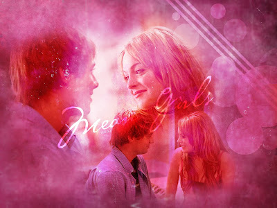
This is a wallpaper from the movie mean girls showing Cady and Aaron in the bottom right of the image also where there is another image quite larger of them again which is reflected above this is shown in a more loving way where we see them both glancing at each other showing love and caring amongst the two. Also the two images of them are also quite close ups so we can see their facial expressions again they have used the colours pink and red all over the wallpaper representing love. there is also some white streaming through the wallpaper in between Cady and Aaron reflecting a new start to a relationship and looking into the future with joy.
However this wallpaper is an influence to us where it could show Selvia and Vigan all in love in a very similar way all in one snap because Selvia could represent Cady as she was also new to the school but falls in love with the bitch's boyfriend also and Vigan could represent Aaron as he is the actual boyfriend. Additionally this wallpaper would also be able to represent the ending to our film where we can tell they will fall in love.
Friday, 9 October 2009
Character Infulence - Russell
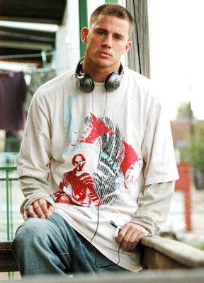
This photo is taken from the movie Step Up. The character Tyler is wearing baggy clothing, portraying a rebellious personality and one of an urban background.
His jeans and simple t-shirt also reflects his laid back personality, one that we also want to create for our leading male role.
Tyler is a young man with a blurry future ahead of him, he is a in foster care with a criminal record, he also has a reputation with young 'gangsters'. However even though he lives in an urban setting, it is mentioned many times in the movie that he is a 'white boy', so his costume suggest to us that even though he's from a dangerous area and is in a middle/lower class cycle, he doesn't fall in the 'gangster' category. Our male lead will also be white so we want to construct the same idea that he will be of an urban social background, however still quite laid back.
The headphones are key as it shows he is not his music and gives him a sense of character, this gave us an idea to also use headphones i our trailer. We also decided it would be best to dress him in casual clothing that is seen as modern in an urban setting, however we have to keep in mind that he still has to look smart as he is in a 6Th form. We also wanted him to be good looking as most male leads in many soaps/movies are.
Tuesday, 6 October 2009
Character Influence - Kate
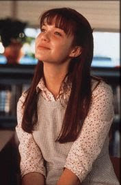
This is a picture taken from the movie A Walk To Remember with the character Jamie in it. We have decided to base Kate's character on her as she is portrayed as the 'good girl'. Like our character Jamie too comes from a good family and strong background. However only when Kate moves away to west London does her life take a huge turning point.
Jamie is wearing a tidy floral shirt and a formal dress that covers her up. We decided it would be too unrealistic if we dressed Kate like this as even though she is from a more posh area, she is still aware of urban culture. However we thought that we should chose costume that will cover Kate up, nothing too short or too revealing. We were inspired to also dress her up in colours such as beige, black, white or grey, like Jamie's character.
We chose this particulate character as once we watched the movie we all fell in love with her, and we wanted Kate to pull the same affect on our audience. So we thought that we would imitate the same hair and make-up style but with an added urban twist.
Characters Infulence - Adel
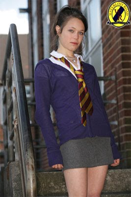
We were inspired by the Waterloo Road character 'Maxine' for Adel's character, which will be the schools popular bully/bitch. When first seeing Maxines character we imidiatly wanted to dress Adel like this too as even though Maxines isnt seen as a 'mean girl' in Waterloo Road, her costume did, thereofr we wanted our audience to think the same about Adel, seeing as our trailer will not have many dialogue in it.
Maxine's costume is a slutty school uniform with the short skirt and different colour jumper to show she is rebellious. However Adel's costume will not be a school uniform seeing how she is a 6th form student. Although, we want to keep the same conventions of a young, popular, white, middle class teenage student.
Maxine's hair and jewelery convey someone with a lot of attitude and we want the same for our character, therefor we have decided to use large hoop earrings and straightened hair, short skirts and a lot of broght colours to show an attention seeking teenage girl.
Song Influence
The 8 seconds until 11 seconds of this grime tune has given us an idea for our trailer. The music stops and starts 1 second each. We thought it would be a good idea if, coming to the end of the trailer, we would show 1 second shots of the most interesting scenes, however since they are only once second it wouldn't give too much away so still keeping the audience locked on.
Therefor we though to use something similar to this grime tune that would emphasise the climax of the trailer.
Soap Influence
The opening of the first soap W10 LDN has given us an idea for our soap. In part one of W10 LDN we first see establishing shots of 'Greenside Estate' and one of the main characters, Elisha moving in with her sister and mum.
We were inspired to do the same kind of plot, however our main character will come from a more posh part of the UK, whereas the audience saw that Elisha was already from a more urban setting, but our character will be white.
In in we also see a troubled home, which we also have decided to include in one of our issues. Our favorite plot line was the love theme and thought that to appeal to our audience which is of our age group, we had to include romance too.
Also the fact that the show is set in urban west London also attracted us to watch it, as our one is in the same setting. In addition to it being on an estate, the shows really captures the feel of young culture with the use of language and music, which we also want to portray.
However we decided to set it mostly around school too, as our characters are mostly 17/18 year olds till in collage/6th form.
Monday, 5 October 2009
Questionaire
12 – 14 15 – 17 18 – 20 20+
Gender:
Male Female
1) Which location would you prefer a soap to be set in?
School Urban area
Countryside Home
City
Other...............................................
2) What kind of genre would you prefer to see?
Drama Romantic
Violence Reality
Other......................................................
3) What sort of music should the soap include?
Grime R&B
Pop Classical
Jazz
Other...............................................
4) What sort of characters should the show include?
Funny people adults
Romantic people teenagers
Serial killers Good looking characters
Other......................................................
5) Which of the following soaps do you watch?
Eastenders Emmerdale
Home & away Coronation Street
Hollyoaks Neighbours
Other......................................................
6) Which conventions should the soap include?
Murders Sex
Drama Humour
Money Drugs
Other......................................................
Sunday, 4 October 2009
Questionaire Results
1 11 6 4
Gender Male Female
10 12
1 Which location would you prefer a soap to be set in?
school 8
country side 1
city 6
urban area 4
home 1
other 1
2 What kind of genre would you prefer to see?
drama 5
violence 5
romantic 8
reality 2
other 2
3 What sort of music should the soap include?
grime 3
pop 2
jazz 2
R&B 6
classical 6
other 3
4 What sort of characters should the show include?
funny 8
romantic 5
serial killers 5
adults 3
teenagers 7
attractive 11
other 0
5 Which of the following soaps do you watch?
Eastenders 12
Home & Away 3
Hollyoaks 5
Emmerdale 0
Coronations Street 0
Neighbours 5
6 which convections should the soap include?
murders 3
drama 7
money 4
sex 9
humour 5
drugs 4
other
Saturday, 3 October 2009
Target Audience Profile
Fortunately, the majority of people would prefer the soap to be set in school, the city or an urban area. Our soap trailer will consist of all three locations so that should satisfy almost all of our target audience. One person suggested that we set the soap in a football club however we do not have access to a football club, furthermore it would completely change our Target audience.
A few people would like it to include romance which is helpful because despite all the violence and jealousy it is, in its own way a romantic tragedy.
Finally, they also would like it to consist of teenagers, sex and drama, which is favourable because our soap roughly covers them all.
In conclusion we intend to keep the audience we originally aimed our soap at because we interviewed people that attend our sixth form. This was relevant because they are able to reflect on our soap and could possibly share have similar lifestyles. In addition they could have the same status's and could have experienced similar circumstances which will engage our audience further because they can relate to the soap.
Thursday, 1 October 2009
TV Times
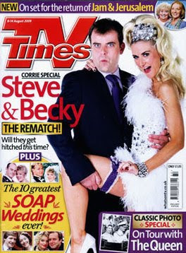
This magazine is from the TV Times including two characters from the soap coronation street. Its Steve and Becky's wedding day as we know this from the way they are dressed. We also did a soap trailer based on their wedding. We get both their names in red and under it their is a caption saying THE REMATCH! in capitals and also under that we get another caption stating will they get hitched this time? with 'this' stated in italics this suggests they have already tried getting married but this time will they actually get through with it. Additionally in the left right corner there is a small yellow box saying 'plus the 10 greatest soap weddings ever' with a few images of other soaps and their weddings.
The colour red is representative in this poster as it highlights all the important features, more importantly it connotes love so it is used as a link to connect all the "love" stories together. The characters names are also red which implys a romantic tone, which is cleverly joined to a serperate attraction which states "soap weddings", we feel this is effective as it joins the stories together without the target audience noticing. The main heading is red too, not only to create brand identity but to show its significance, therefore all the key aspects are conveyed through colour.
TimesRadio

The background of this magazine sets the location and anchors the audience into their world, and shows that the addition is focused on Dr Who. Furthermore, the foreground is predominantly an image of the two Doctors presumably going head-to-head.The position of the characters creates equality between the two Doctors as they are standing in the same way and have an equal share of the cover. Standing with your hands behind you back suggests authority and importance as a Doctor should have again making them equal showing that either one of them could be the Doctor. However there is a sense of conflict between the two as the new and old doctor fight to be the only one. So having said they have equality between them, the new doctor seems to be smirking which could propose that he feels superior to the older doctor because he is younger and more current yet it could also suggest that he is immature and cheeky.
There is a coherent theme through out the most of the text. Firstly, the magazine name and pun are both in a big bold white font that keeps the cover simple. The clever pun "Who's Who" is effective because it is humorous so could help engage the audience to buy the product and better yet, watch the film. Furthermore, the magazine was the november addition so they used a poppy flower which says that they support Rememberance Day and it gives a kind of patriotic feel.
TV Guide Scan

The first that we see when we see the cover is Ronnie and Roxy from Eastenders, and the heading "Ronnie's shock EXIT!", word 'exit' is what helps attract the customer as it leaves them curious.
We also have other soaps on the cover as secondary pictures with titles such as 'Ken dumps Deirdre!' this attracts the customer as it acts as if they know who Ken and Deirdre is. Also we have another title 'Who's the daddy Heather?' adding humour.
The cover also includes the main title 'TV MAG' in big bold red writing in its usual place, so it stands out next to all the soaps titles. It also has the magazines website underneath, with other additional information.
To help make the magazine stand out, out of all the other magazines on the stand, they use a lot of colours, flashes, exclamation-marks and the soap stars faces on the cover.
Wednesday, 30 September 2009
W10 LDN Poster

This is a poster of W10 London, it shows all the characters in the foreground with an estate in the background, similar to what we will do in our poster as we will also have an estate that we have used in our film in the background however we will have only three of the main characters in the foreground. They used dark colours such as grey, brow and blue making the scene seem quite rough and old.
Hollyoaks Poster
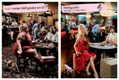
The Hollyoaks advert is quite vague in what it represents, its mocking other soaps such as Eastenders, Emmerdale, Correnation St, and that Hollyoaks isn't about drunken people at pubs, but much more young, glamorous and sophisticated.
The poster has a theme of spot the difference running through it, as the theme of a social setting run through out both. However one is set in an old, dirty pub, and the other is in a bright, glamorous bar.
The cast is also different as in one they are old, overweight and middle class, and the Hollyoaks one everyone is fit, beautiful, young and rich.
The slogan "rub some Hollyoaks in it" reinforces the idea that Hollyaoks is more for the younger audience and that Hollyoaks isn't the same as all the other soaps. Furthermore, as seen rubbing Hollyoaks on the photograph elevated the image giving it a sense of celebrity-feel. This could suggest that by watching the soap the pun is echoed and their life is uplifted. In addition, the lower class audience could watch this in attempt to escape their boring life style.
The channel in which the soap plays on is revealed on the lefthand side because that it the side of which the "true" hollyoaks is portrayed. The channels' symbol creates brand identity as it is well known, this benefits the poster, as people who are not familiar with the soap trust the channel so there for want to watch the soap, as a result the symbol could possibly attract potential viewers.
It could be argued that this poster is making a mock of other soaps as on the dirty half it is set in a "pub", which soaps such as Eastenders and Emmerdale have, and plays a huge role in their soaps. Therefore, it the Poster raises the soap, stating that it is better than any other soap, this is successful as it promotes the soap well.
Soaps are predominately watched by women so the main attractions of this poster are female. The right side appears to be more feminine; clean, glam and elegant. The dog chosen on the right hand side also connotes an rich, female celebrity whereas the other dog is more masculine and unattractive. More over they used pink to enhance feminine tone to the poster.
Finally, this poster both follows and challenges conventions of a successful poster, firstly because the target audience are not focused on the poster for a few seconds, because of the 'spot the difference' theme so they audience have to concentrate harder on the poster. This is risky because at first glance the audience might be confused a not be drawn into the poster, therefore not promoting the poster to its highest potential. However, it is primarily image, so it does follow that convention
Wednesday, 23 September 2009
90210 poster
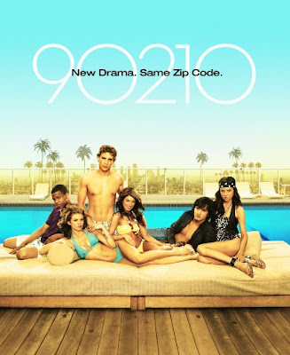
The poster for the new 90210 season is very typical as it shows the life style of the teenagers living in modern, upper class Los Angeles, Beverly Hills.
The poster is quite eye catching from the bright blue background, the swimming pool, green palm trees, beige flooring and sofa, as it makes it very neutral and laid back. Also the cast makes it seem laid back as they are in swim wear just lounging.
All the of these attract the audience as the fresh look could represent a fresh new start with new themes and plots. The slogan at the top of the poster reinforces this as it clearly states "New Drama" however to ensure the audience that it hasn't completely changes is also states "Same Zip Code" as the programme is strongly based in on one place, hence the title "90210". The slogan helps maintain existing fans who are already familiar with the drama yet attract a new audience at the same time.
In terms of conventions, this poster generally follows most, for example the layout is largely based on the image, which also follows the rule of thirds, portraying a blue sky, palm trees and characters position. It also promotes the show as the layout reflects the glamorous lifestyles they live, which could attract people with similar ways of living or, better yet attract an audience that live in opposite ways, and seek to escape their 'boring' lifestyle. The characters also address the audience with direct eye contact which provides a more personal and friendly feel, drawing the target audience in, and successfully promoting the show. Furthermore, there is minimal text, with only a tag line and title, whose colours compliment the poster. However, the poster does not consist of the show times and general information, this is because it only advertises the show and not the times it is played because it is very popular and people already know when it is on.
Skins Poster
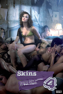
The Skins poster, at first glanced seems very disturbed, as it consists of naked, drunk teenagers kissing each other. However if u look close you see that the main character Michelle is sitting alone at the top, which could show that either she has more authority than the others or that in the next seasons show, she will not be in a relationship and therefore is portrayed as isolated. We also see Sid sitting alone at the other end of the bed suggesting to the audience that the story line might be a lot about them.
We also see Anwar kissing a girl that's identity is not in view, creating suspense for the character as they don't know who she is. This is effective as it enhances the poster making the audience ask questions like" who is she?", and "why are they all undressed?".
The poster is also quite stereotypical view of teenagers today, as most of them are wasted. But also showing the audience that the show will still consists of a lot of partying, troubles, sex, and on/off relationships. These aspects are all things that the target audience could possibly relate to and further persuade them to watch the programme. Teenagers could also be divided into subcultures in which a majority could share similar qualities to the characters in the show.
Posters are often image dominated, intentionally to focus the audiences attention on the main feature. This poster definitely has followed this convention as it is noticeably mainly image. The photo speaks for it's self and intentionally portrays the soap in a vivid and dramatic way. We felt that this approach was successful because it does not take too much of their time yet still engages them enough to convince them to watch the soap.
Additionally, it is conventional and better yet, necessary for posters to state the title and issue date of the soap. Overall, this poster has successfully made sure that in just a few seconds their target audience is attracted by using techniques that appeal to the market. The layout was very important as it followed conventions and satisfied expectations as it had minimal text and a large image.
Coronation street trailer
The trailer of coronation street shows a typical wedding day. It starts off with the main character opening a wedding card allowing the audience to know its her wedding. the camera is mostly concentrated on the writing on the card quoting 'Good Luck on your Big Day' we get a repeat of the words Good Luck throughout the trailer - on the back of the car in big letters and also on the cake which the camera gradually zooms in creating a tense atmosphere the writing is last seen on the back of the wedding car as it moves. however just before the zoom into the cake we get a shot of fingers crossed indicating a sign. The repetitions of 'Good Luck' over elaborates a perfect wedding day which we the audience know it doesn't occur in any soap.
In addition there are many long shots in order for us to visualise the scene and many close-ups so we see all the details of the importance of the items which also emphasises the key points of the story.
Becky has some slight slow motion added to her shots as it emphasises a dreamy and fairytale like wedding as her dress is pink as well as most of the items in her wedding.
The sound is non-diegetic so we only hear happily wedding music throughout the trailer except for the end there is a last piece of voice over saying 'friday the 13th the perfect date for a coronation street wedding', this tells us the actual wedding day for the episode. The word 'perfect' indicates a perfect wedding day but we know that from the ending of this dialogue it wont be a perfect wedding day from the way it is said.
The soap consists of multiple narratives which is certainly conventional, furthermore it has a narrative theme that connects all the events together.
Additionally, camera work was used to hyper-dramatise the trailer as it was filmed in a glamorous way. The bride-to-be is filmed in an alluring through slow motions, high angle shots and close-ups. We felt this was very affective because it exaggerated the events in a subtle way, in order to maintain realism.
Moreover, it is located in a familiar scene, not only to attract viewers from that area but to create a sense of regional identity. We think that this was essential as it brings the comminity together in the soap, and furthermore makes the audience feel more involved as they recognise surroundings and are familiar with the loactions.
Finally, it is closed with a title card which is coherent through out Corrination str. that informs the viewers with the times and dates it will be shown. The well-known theme creates brand identity and similar to the location, it is recognised by existing veiwers so could possibly make them feel more welcomed.
This trailer primarily follows conventions of soaps because it portrays domestic themes that are realistic and deal with personal or family relationships; the wedding. In addition, the trailer over stresses the wedding and finally ends it in a cliffhanger which is expected, because it can not be finalised as the whole point is to engage the audience and convince them to watch the soap. We think this trailer is successful as it adheres to conventions of its genre and therefore keep the audience satisfied.
Eastenders trailer
This trailer was created to introduce the new characters in Eastenders. Through the music and editing the team cleverly portray the new Mitchell sisters as outgoing and mischievous. Every so often the music is interrupted by a non diegetic sound, when Ronnie Mitchael is introduced there is a still image of her accepting money and a "kerching" sound, possibly suggesting she are well off and financially stable. secondly when Roxie Mitchael is her still image get a glisten and sparkle on her name along with a "ping" to reinforce the image they are trying to portray, possibly that she is spoilt and girley. It begins with slow motion shots and slow close ups of other existing character but gradually the pace increases as Ronnie and Roxie appear. This is really affective as it builds tension in the audience, the actors in the trailer are agitated to see who is new to the square, which could encourage the audience to watch eastenders, with the new and cool characters. This has inspired us to make our film include more tension, so in a similar way we could increase the speed of shots as we get towards the end of our soap trailer.
A division is created between the new and old characters through costume and lighting. The old characters are shown first and are dressed in dull and dreary colours however as the trailer progresses and the music gets faster the Ronnie appears with her blood red, open cut top which helps the audience create a better image of her. The red could propose that she is devious and intimidating, however the
addition of her red lips might imply sexual undertones and that in fact she is quite passionate. Similarly her sister is also wearing a red vest but the hat that she is wearing is more symbolic. The cowboy hat represents a more wild and outgoing personality and to add to the cowboy image it seems as though she is riding a horse, hen in actual fact she is dancing. In our film trailer we also want to use costume to separate the good characters from the bad.
After they have been introduced separately they get together and start dancing whilst the other characters form a circle around them and dance, it shows that from the girls presence all of a sudden everyone is having a good time; the sisters are entertaining, therefore it reflects on the soap and will make people watch it.
Furthermore, the mood in the trailer is also an effective of engaging the audience, at first everyone seems to be confused however as the sister come in the atmosphere is more amusing. This is effective because it will persuade the target audience to watch the soap with the new characters.
The font used to summarise the trailer is coherent through out the trailer. The font relates to the trailer because it reinforces the idea that they are party girls.
The trailer follows the conventions of a soap as it uses hyper dramatises the situation with the party like theme, it could also be a way of showing the audience how these two new characters will make the Mitchell household a lot more exciting with new drama, this is conventional of a soap trailer because this technique creates a more appealing and trilling tone which engages the audience. Moreover, it follows conventions as it uses self parody with some of the characters such as
Tuesday, 22 September 2009
Waterloo road trailer
The shots in this trailer are about 1 second long which makes the scene chaotic, additionally it reflects on the situation as everyone is worried and scared about a gun being in school. Furthermore there is a variety of high and low angle shots which helps to create a division between the characters who have authority to those more vulnerable. The high angle shot of Earl Kelly shows that he is powerful, moreover we also know he has a gun. However his little brother is framed in a low angle shot where he is shaking his head for something we could only imagine he does not want to do, again this adds to his insecurity.
Furthermore, there is a 360 degree shot of the head teacher which changes speed; fast and slow motion. the character is rooted in the center while her surroundings are being shown to the audience like the pupils and the police car. It reinforces the idea that she is confused and scared.
The editing also helps convey her confusion at the end where the students are overlapping the mid-shot of herself. When the overlapping goes away she get ready to walk away and clear her mind. Additionally, the editing focuses on outlining the main narrative.
There are a few diegetic sounds like the gunshot, screaming and some dialogue but its dominated by non diegetic sound. The use of non diegetic sound of the dialogue is very helpful as it explains the narrative, moreover it adds validity because we hear it from the character.
There is also a voice over that tells us what the show is and when it plays. Furthermore the music makes the trailer more exciting and continues the coherent theme as its the same music as the actual soap.
One of the main characters in this soap trailer is the head teacher, Miss Mason. She is dressed in a suit which shows she takes her job seriously and is committed to her profession. Her dialogue is dominant in the trailer and it helps the audience create an positive image of herself. "I don't want this school to be associated with fire and scandal" evidently suggests that she is Caring person, however, ironically, whilst she says these caring words the scenes in the trailer are brutal.
The trailer portrays the storyline through the head teachers point of view, which we think is effective because it helps create a division between the teachers perspective and the pupils actions. However we have decided not to do it this way because then our target audience cannot relate to the soap.
The trailer follows the conventions of a soap as it uses only the dramatic shots from the series, giving it a lot of impact, this leads the audience to carry on watching. The other conventions it follows is the music they use is upbeat reflecting the messy situations, the mess camera shots also reflect this.
Wednesday, 16 September 2009
Eastnders Trailer
This trailer of Eastenders dominantly conveys emotions and characters through camera work and sound. The opening shot is a close up of a characters feet this goes on for a while creating suspense for the audience. This is followed by a mid shot of max which shows the audience the character in trouble. The high angle shot of Max gives the audience a judgmental position. The next over the shoulder shot introduces his son Bradly who is in uniform suggesting power. We see aspects of self-parody when Stacy is presented as a cleaner, this is mocking her low moral values.
Further more, the bluesy music used helps add to the suspense and mystery of the trailer.
There is no dialogue so everything is conveyed through body language and eye contact, this emphasises Max's isolation form is friends and family.The sound is echoed through the trailer and they also use diagetic sounds that also helps to create the silent and isolated atmosphere.
The lighting is very distinctive. At one point the light is only shining on max which puts him in the spotlight as if he is being judged.
Stacey's slow motion walking is effective as it creates suspense for the audience.
The close up shot where Stacey presses the button for Max's lift, suggests imprisonment and how the lift closes on him showing how Stacey has turned her back on him. We then move to see Tanya pulling out a morgue, suggesting that to Tanya, Max is dead.
The we get a twist where Max turns around and Jack appears. Jack is holding a death ticket with Max's name on it, connecting with the trailers slogan "he's made his bed, but will he lye in it.
Multiple narratives are common in all soaps as they follow the lives of the characters from different viewpoints. This trailer follows the conventions because even though Max is the character the audience follows, we still see it from other characters view point such as Tanya, when she’s standing by the bed in tears it leads the audience to the idea that she’s upset and heartbroken, yet still very angry at Max’s affair. In addition, the trailer followed a non linear structure as the events are portrayed out of chonological order, this is also typical of a soap trailer.
The trailer is very hyper dramatised as it plays on the Stacy and Max affair storyline, this follows the conventions of soap trailers as they usually hyper dramatise the storyline and make it seem bigger, attracting the audience as it keeps them watching.
Self-parody: Following the hyper dramatic approach, the trailer also consists of self-parody, especially to Stacy and Bradley’s character. As the viewers know that Stacy is having an affair with her, soon to be, husbands father, she is viewed as the bitchy, slutty character, hence the bawdy maids costume.